 0 samples
Colours for a Happy Home
Colour, “a property causing visual sensation”, reflects who we are. It can influence mood and evoke powerful feelings and emotions.
When decorating your home, considering how different colours affect mood and reflect your personality can help to achieve a more contented environment suited to your individual preferences. Here’s our guide to introducing a rainbow of vibrant and joy inducing colours for a happier home in 2017.
Yellow
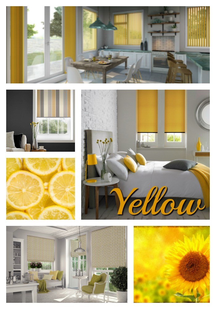
If you’re searching for an uplifting colour to help you look on the bright side of life then look no further than yellow.
Upbeat and friendly, yellow is the colour of happiness and sunshine. It is also reported to cause the release of serotonin, a neurotransmitter chemical that contributes to a feeling of well-being. So, scientifically speaking, it’s the best colour to lift the spirits.
The colour yellow also has the power to stimulate creativity.
Whether light and airy or bold and bright, yellow brings vibrancy to any room, yet it’s best used in bedrooms and bathrooms.”
Style Tip: Yellow can be overpowering, so allow yellow accents to shine against a sophisticated grey backdrop.
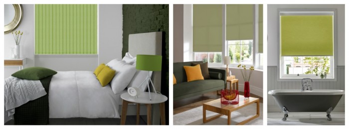
Green
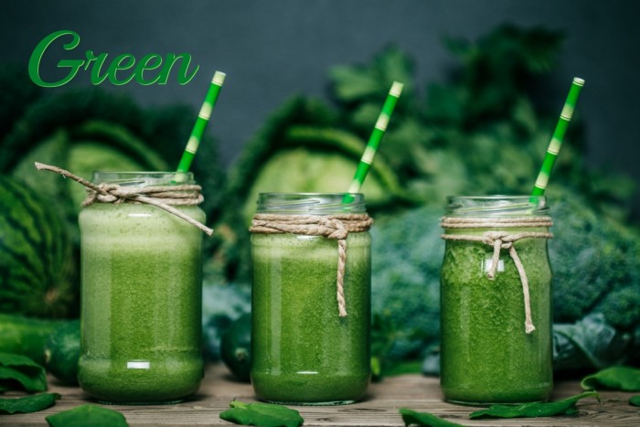
“Green mimics nature. In its softer forms, green is a soothing shade that aids concentration and relaxation. Bolder greens are the sign for ‘go’ and can be a galvanising force.
Using green in the home can have a grounding effect that connects homeowners to the outdoors. The correct shade will make a room feel like it links seamlessly to what’s outside the window.
Colour experts Pantone chose Greenery as the colour of the year for 2017.”
Style Tip: Mix and match tones of green by drawing inspiration from the garden.
Blue
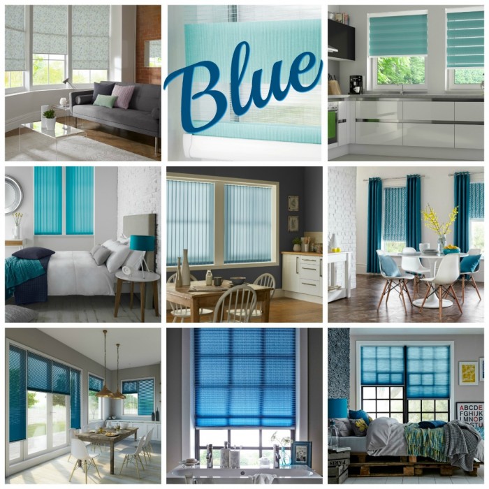
“Blue symbolises loyalty and trust. Those who choose blue are considered confident and dependable.
Overall, blue is a calming, serene colour that, even in its bolder forms, is considered beneficial to the mind and body.
People have been found to be more productive in a blue room because they are calm and focused. Blue tones work best in bathrooms, studies, and bedrooms. It’s also an ideal colour for small rooms.”
Style Tips: Use a blue with a warm undertone to stop the room from feeling cold. Create the illusion of space with similar tones on the walls, mouldings and floor to merge the boundaries of the room.
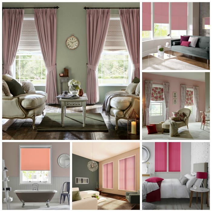
Pink
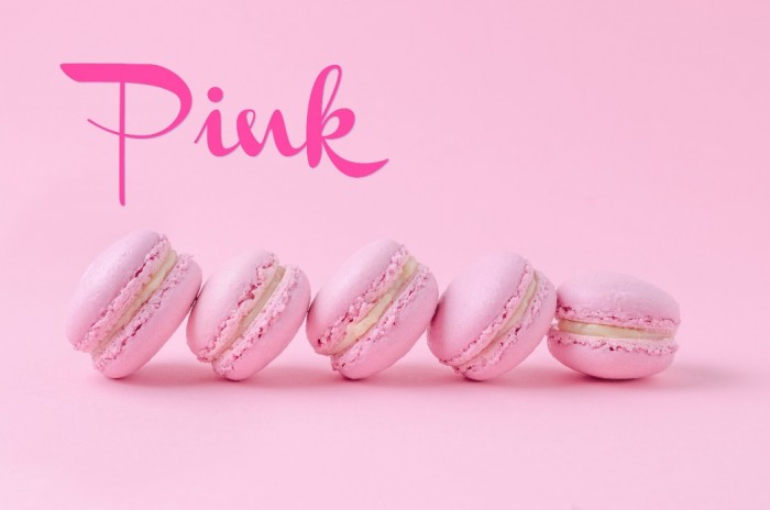
“Pink is the choice of a loving, kind and generous individual.
Pale pink reflects warmth and sensitivity. It’s also the colour of romance and sensuality.
Vibrant pink signifies an optimistic outlook on life. It is fun, energetic, and inspirational.
Pink is best used in domestic spaces such as living rooms, dining rooms and bedrooms.”
Style Tip: Pink can make a space feel small. This colour is best used in a space with large windows or that gets a lot of light.
Red
“Red demands attention and denotes a lust for life. It symbolises optimism, confidence, and vitality.
Studies show that red raises the heart rate and induces emotion, so it is ideal for energetic homeowners who like to get things done.
Red used in living spaces will make a room feel opulent and welcoming. It also creates the perception of warmth, especially during the winter months.”
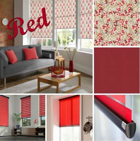
Style Tip: Red can be intense, so introducing pattern can tone it down without losing the vibrancy.
Browse our red blinds or find your nearest stockist!
Check out our Pinterest to be inspired!
Comments are closed.