 0 samples
Style Steal – Rose Quartz and Serenity
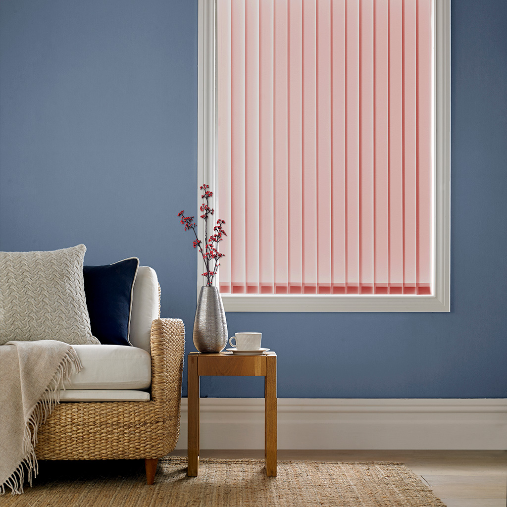
Pantone’s colours of the year are always guaranteed to take the world of interiors by storm and this year, the colour experts surprised everyone by introducing not one, but two hues, designed to work in harmony with one another.
Why not try to introduce this year’s perfect pairing, Rose Quartz and Serenity, into your home.
Calming ‘Serenity’ blue complements the light and tranquil rose quartz pink; both colours are muted enough to use across entire walls as a backdrop, yet sufficiently bright to add colour and appeal when used on accessories such as cushions, throws and of course window blinds. But the best thing about these colours is how beautifully they work together.
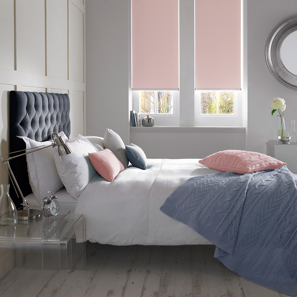
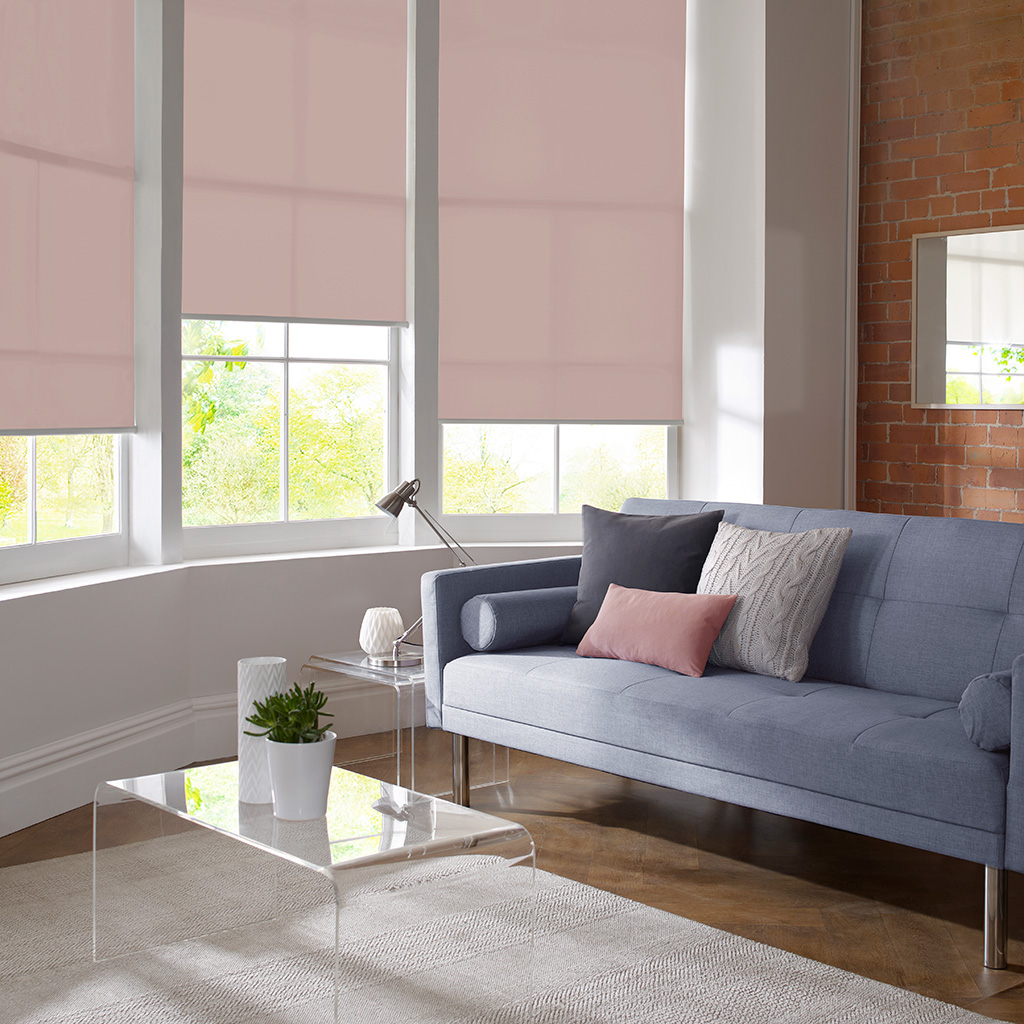
Calming pastel colours are known for their soothing and uplifting qualities and can create gorgeous light, airy and relaxing rooms. If you’re using both of Pantone’s Rose Quartz and Serenity tones then aim to keep the rest of the scheme neutral – these shades work fantastically well with greys but a touch of deep midnight blue, charcoal or silver will also add depth and interest to your room without making it look cluttered and chaotic.
Browse our blue and pink shades for more blinds in this colour.
Comments are closed.