Pantone Colour of the Year 2022
Pantone have announced Very Peri as their Colour of the Year 2022.
For the first time Pantone have created a brand-new shade. Very Peri is a luxurious purple shade that encompasses blue tones infused with red-violet undertones. We have put together some tips to help you use this colour within your home.
 How to use Very Peri
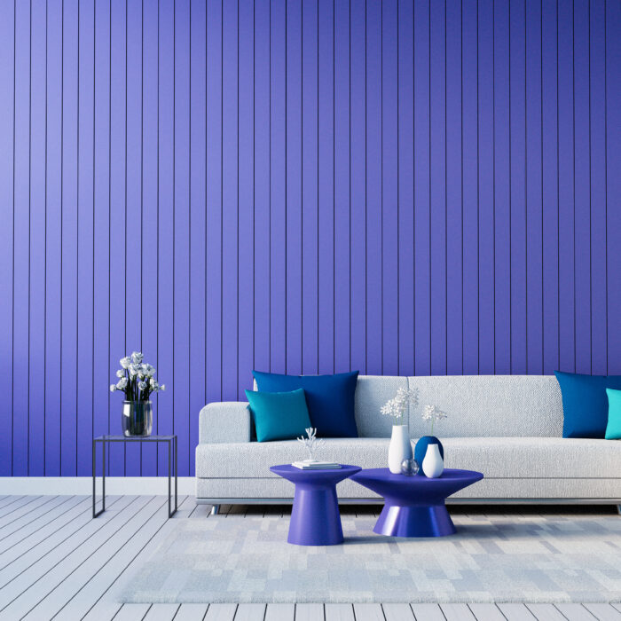
Very Peri is a powerful colour and it can seem daunting to embrace the colour within your home. However, the versatility of this colour means it can be used as a statement colour or incorporated into the home in a more subtle manner. Home offices are becoming increasingly commonplace in the home as a lot of us are still working from home. It can be hard to be as productive and creative at home as you would be in the office. Use Very Peri as a statement feature wall colour to create a home office space that gives off creative energy and boosts your overall productivity. If you are not looking to redesign your home office but still want to incorporate this colour try adding subtle accents such as candles, vases, wall art and scatter cushions to a neutral interior to create a calming and relaxing environment.
Use Very Peri is an unconventional way
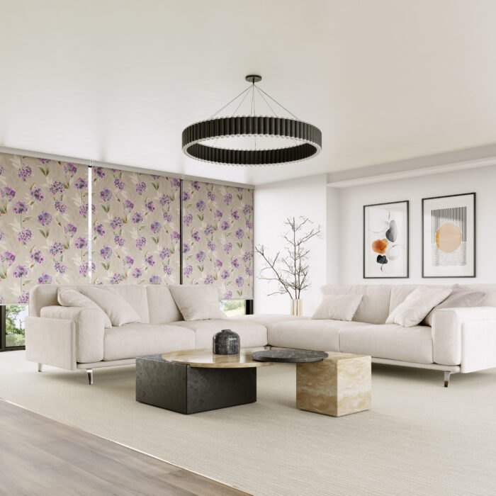
When people think about using colour in their home they always think of their walls and accessories but what about in your window coverings? Adding colour to your window blinds is the perfect way to brighten up your window and add colour without overpowering the room. Having the main colour in your window blind also means that you can change up your room accessories more often with different patterns and colours.
For more inspiration on how to use Very Peri check out our new Pinterest Board!

 0 samples


Comments are closed.